Conventional web design? Would you go this way?Chapter 3 thoughts
There are many things you can do when you are a designer. As a designer you want to be the most creative you can be, you want to explore new things and be innovative. Why not? This is why we have been studying all of these years to become "artists" of the web, animation, marketing...
There are many things we always want to end up doing, and I am pretty sure we all want to land in a job and be the best we can be... but did you know that sometimes is good to use the conventional and let your creative self to one side. Being conventional does not mean that you are not a creative person, it means that you know that sometimes to achieve what your audience is going to interact with, you have to keep what they already know. For example, as explained in chapter 3: the stop sign. It does not change even if you are in another place of the world.It is always red and with the same shape; the reason being that conventions make life easier to digest!
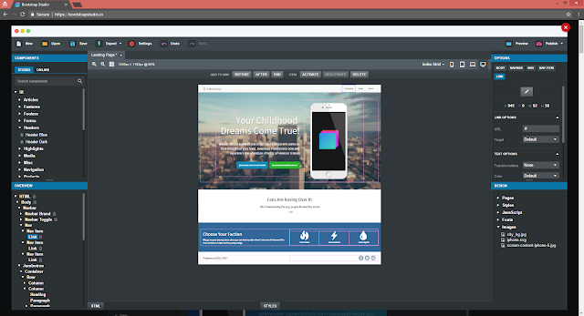
When designing for the web, there are some conventions too! Like how you place your logo in the top left, or how the menu bar is always placed on the top of the page or in one side of the page. We read from left to right, and somehow this is how our brain processes things in an easier way. Also keeping hierarchies is important because it will give the reader a faster way to scan through all the information on your page... so what is really important? Well it is important to be creative, but to always keep in mind what people are used to in order to make the user experience for your website better, and also to make things readable and easy to scan!
Conventions are good, but if you are creative enough and know your way around problems: TRY SOMETHING DIFFERENT!

Comments
Post a Comment