Posts

Showing posts from 2016

Medium

Networking sucks. Because people don’t give a shit. This article, “Networking sucks. Because people don’t give a shit”, made me really think about what kinda of people I want to connect with after college. In our field, networking with the right people can land you your next job. But there are definitely people you meet that only want to know you long enough to find out if you are any use to them, like a means to an end only and not a human being. Jon Westenberg lists a few simple but effective traits to watch for for people who generally care for you. Westenberg lists people that people who genuinely care will chat with you, help you with anything anyway, and ask you for realistic favors. Something that resonated with me was “I want to meet people who give a shit. They don’t have to be wildly successful, they don’t have to be able to help my career, they don’t have to have a background in marketing or business, I just want them to care about what I do, what I love, and
Medium Post: Web Design Is 95% Typography — And in Mobile?

URL:  https://higheredrevolution. com/web-design-is-95- typography-and-mobile- 964e8bd50d09#.ngugxss6z In this article Morten Jacobsen touches on the importance of Typography in web design. He does so however, with a focus on Mobile Platforms. He emphasizes on a few main components of good typography for web design viewed on mobile devices. These include the "Number of characters per line". He explains that designers should use 30-40 words per line as a basis for lengthy designs. He explains that any more than that typically will appear cluttered especially when switching over to a mobile device. Other "rules" are listed and at the end, he mentions some of his thoughts on the iPhone 6s plus. Explaining in a nutshell that it is the best reading machine ever and that he has high hopes for the iPhone 7. Overall, it is a very interesting article with extremely important tips that will help when designing for mobile use.

Medium Post: Presenting your webwork

https://medium.com/life-without-pants/web-design-how-to-present-your-work-and-why-a-good-presentation-matters-a-lot-3cd0ce3a05d2#.k3ncpr843 A presentation can either make or break anything – especially if it’s a pitch! In Matt article, he shares his experiences and insights on how to present your webwork in a successful manner to a client. When you are designing a website, there are various questions that come to mind. Matt suggests answering those questions during the presentation to the client as well to paint the picture of the website for them and ensure they have a clear vision of it. Another point he makes is to remember to consider scability. He explains, “ A common mistake in web design mockups is designing everything to (only) fit into a very perfect layout. Even if you do have all of the final content in-hand before heading into the design phase (big “if” there, no matter how strong your process is),   everything should be designed with the ability to scale. ” Anothe

Medium: Web Design Tips

https://medium.theuxblog.com/web-design-tips-better-user-experience-boosts-conversion-rates-f883c5c87e2c#.ybk6ec1hf Tips are always great to come across - especially within the world of web design! I really appreciated the tips the author provided in this article because it gave me a better understanding of the kind of experience B2B companies they would like the user to have when visiting their website. For example, the author explains the importance of having easy navigation on your website. "You are dealing with decision-makers under pressure and you want to have the most important information readily available, with easy navigation from step one to the others, avoiding any external distractions." As web designers, it's easy for us to get caught up in making things look "cool" and "different" on our websites, but sometimes - especially when creating websites for B2B companies, it might be best to just keep things simple and direct. This way

Advanced Javascript Libraries

Thought this article might be helpful for anyone looking for simple Javascript functions and corresponding javascript libraries. https://www.smashingmagazine.com/2009/03/40-stand-alone-javascript-libraries-for-specific-purposes/

Medium Post: Web Design & Mobile Applications in 2016

URL:  https://medium.com/@subsign/ the-evolution-of-web-design- mobile-applications-in-2016- f7906888eeeb#.gqlk4dm85 In this article Subsgin(author) touches on the trends we saw in 2015 and their evolution and shift into 2016. They focus on web design trends that support mobile platforms because as stated "Nearly half of all online traffic in 2015 came from mobile devices." Some of the highlights include interfaces built on cards, which is when information is displayed on cards much like a drivers license. There is typically some sort of image with info around it giving a very precise and neat presentation while also being supported on mostly any platform. "Illustrations and drawings" were also noted as being a hot trend in 2016 that was very easy to duplicate and typically supported on all platforms as well. Sort of like Emoticons, this is when images are represented using an illustration typically resembling that of a cartoon. Overall, I found it was very inte

Medium Post: Web Designer Tips: The Importance Of Website Maintenance

ttps://medium.com/@ myaggregatethoughts/web- designer-tips-the-importance- of-website-maintenance- 58fd804af8e2#.6k3hhbqob In this article Ayushi Singh goes into detail about the importance of website maintenance. Ayushi is great in explaining what to look for in terms of issues with a new site. For example, if a website has a high bounce rate. That can mean that visitors aren’t being involved and that you should include more information to draw in additional visitors and keep them there. I feel as if this article is of importance as it goes into the key details of what it takes to understand the results of your website. After all, you worked extremely hard on your new design, wouldn’t you want to check if its a hit or miss?

Website

Link to my website: https://heillyb.github.io/web/

MEDIUM POST: Game Design

So I read an article that describes some approaches to game design, which is one of the areas that I would like to pursue as a hobby: https://medium.com/@AntonMartynov/games-as-a-tool-of-self-discovery-29e3111c92fa#.9gvmmuboc It's conclusion: "When creating a game we should strive not only to entertain and put inside our own opinions. Game should be the tool that helps a person to be a co-author of their experience, to develop in the directions that he or she had not seen for themselves before." I agree with the author of the article. I find that games that do provide such unique experiences and possibilities tend to be not only more entertaining, but also rather insightful. One of such games, from my personal experience, was Undertale, a game that provides a deep connection to the world and its characters that are being explored despite being very graphically simplistic. The gameplay, like the story and its characters, are unique too, as when the player i

Open source word processor in the browser

Life blessed https://medium.com/always-be-coding/facebook-just-moved-the-world-of-browser-based-editing-forward-2cc541c83974#.fg2qz8xve

Web Design for Wearables

https://medium.com/@piotrbakker/web-design-for-wearables-eaf3a5522cae#.mrn74qcrl In this article, Piotr Bakker explains what designers should expect when it comes to visitors using a new kind of mobile device, wearables! He explains the change of devices calls for changes in website designs. He explains two key elements that include having designs be Actionable and Glanceable. Basically stating that a design should include enough information to view at a glance and get the overall idea that the designer was attempting to display. That users are less likely to read on a watch as they would with an iPhone. He also explains that it should be actionable. You should be able to sign up with one click, or call with one click. Users shouldn’t have to go through several phases to get something done. Overall, this article has great importance. At least it seems to or definitely will in the future with the way technology is heading.

MEDIUM POST: The power of algorithms

Image
After the election this year, many people began to blame Facebook because of its spread of "fake news" and other kinds of misinformation... And we all know that Facebook has a really powerful algorithm.  It might be really bad how all of these fake news are misleading the world and making us take bad decisions in some way. The problem with this algorithms is that their filters select the information we see in our feed! As explained in the article,  An algorithm is a procedure or formula for solving a problem, based on conducting a sequence of specified actions. (Go  here  for more) In the world there are two "cultural algorithms" that rule the world: the ones for creating money and the ones for profit making. These two have influenced the formation and design of many companies and the economy globally. Have you ever thought how money is created? I do not think any of us know how this works... but it all comes down to an algorithm: money=debt+ interest. Y

Medium Post - Kill Your Comfort Zone

https://medium.com/the-coffeelicious/kill-your-comfort-zone-f7d624d85805#.lmf89ildc I found this post to be very inspiring and refreshing - it wasn't just one of those redundant self-help articles you always come across. The article talks about the importance of stepping out of your comfort zone, no matter how uncomfortable it makes you. If you're the only woman in a meeting, force yourself to speak up, if there's a new place you want to explore, buy the ticket, what are you waiting for? There have been so many times where I have missed out on things, simply because I'm too afraid to step out of my comfort zone. And I've found that every single time I've stopped doubting myself, I landed amazing opportunities with companies I only dreamed of stepping foot in. The author, Bianca, also gives some good tips on how to overcome that uncomfortable/nervous feeling you get when trying to get out of your comfort zone: " Identify the things that scare you. Make

Prototyping - A Medium Article

Much of my work over the past few months has been user experience focused at the core, across multiple platforms and use cases. Designing the perfect user experience and implementing it in a great UI requires iteration after iteration, prototype after prototype. Collaboration with the business side and engineering side is essential along the way. As this Medium article pointed out, prototyping has failed to reach a consensus in the design-business-engineering world. There are a plethora of options, from creating static layouts (think Photoshop) to interactive experiences (think Adobe Experience Design or Sketch3) albeit with limited functionality. As a designer working to quickly turn prototypes into functioning beta products, I find that none of the available options truly maximize the potential for rapid but effective and efficient prototyping. Thus, I opt for pure HTML/CSS/JS. Until the perfect prototyping software comes along, I find it easier to use web technologies to des

Medium.com: "I don’t belong in tech : Trying to find my place in the place I love, and constantly failing"

The article I choose to write my thoughts on is "I don’t belong in tech : Trying to find my place in the place I love, and constantly failing". As a developing designer and coder, it's comforting to know that you aren't always going to be comfortable creating things. A section of text that stood out to me that was "I sit in last place and watch. So I choke down my values and discomfort and attempt a push of my own, amid the internal screams that this is wrong and irresponsible and how dare I. I don’t get very far. My feeble, half-hearted steps cannot compete with your bold, proud strides. So I cower back to my corner with my broken brain and peep at your success through the leaves." It's super hard to wrap around the concept of "Fail fast and early" concept, so it scares developers into not creating anything. So we often find ourselves comparing ourselves to each other. It's often a comparison that doesn't take into account our own co

Medium Blogging

So this is the article that I thought was interesting: https://medium.com/hi-my-name-is-jon/networking-sucks-because-people-dont-give-a-shit-c824715c312d#.g5uehlffo Networking sucks. Because people don’t give a shit , that is the title of the blog post. I think it is relevant for us who are graduating and trying to get in touch with people that can help us out with our future. We all want to connect with well succeeded people and benefit from that relationship, but networking can be meaningless sometimes.  We often forget about the human side of the person we trying get a job with. As the author points out, there is no purpose on collecting a bunch of emails if at the end you have nothing to do with those people. We don't get to know them in detail apart from their work life. If we care about the individual, then true networks can emerge and that can become a more human connection, even friendships, and then helping each other out will be much more natural and pleasing proces

medium post

Which Colors to Avoid in Web Design This article helped a lot to understand what color styles should not be on a certain palette of taste. I agree that the power of colors in designing should not be underestimated. It is what sells the product or makes a design unique and special. This article explains the proper way to use neon colors to highlight or prioritize content. In most cases, the colors to be picked should relate to the product or to the artist's aesthetic. Overall, choosing colors that does not contrast well together will lead to disappointment. Appeal matters in designing and choosing the right colors will always be a plus in web designing. The artcile also suggested to use Adobe Color CC to match the colors you choose. I think that was very helpful because I did not know there were tools as such.

Facebook the new internet

I read the article where the guy pretty much doesn't like Mark Zuckerberg. It starts saying that he is the most powerful man on earth because there are mostly 1 billion people connected to it every day. That even the president of the United States with the most powerful army in the world, he will end his term on January. For Zuckerberg it is not going to end. He has obtain the companies of his two computers which were Instagram and WhatsApp. The author makes a good point where he says that we wants to reach to everyone in the world. But is this a greedy goal or he just want everyone actually connected? In my opinion he is doing it just to make a change around the world. The Author of the article which his name is Larson also mentions how Zuckerberg still trying to get to China which hold the biggest population on the world. Facebook was banned in 2009 by the Chinese government. Zuckerberg wants everyone connected that he even plans to send as much satellites as he can to space to

Elizabeth "medium post"

https://medium.com/the-mission/this-10-minute-routine-will-increase-your-clarity-and-creativity-7ce61b11c2f9#.ov7qnif03 I believe that our minds are strong enough to impact our life in ways to determine success or failure. I found this article to be very interesting for that very reason. This article talks about a 10 minute routine that can help with your clarity and creativity. The routine before going to sleep is the time to clear your mind and write down any thoughts/questions you might have. Focus solely on goals you want to accomplish for 10 minutes. When you go to sleep your subconscious is up coming up with answers to some of your questions. When you wake up you should try to avoid your phone or any technology for at least 15 minutes. Instead of turning to your phone try to relax and reach the subconscious of your mind in order to access those thoughts. This can relate to the front end of creating a web page. Sometimes you might feel stuck on what exact content you want

Ethics and Design

I wasn't really looking for something along this topic but I recognized the designer and found myself reading his article, "The Art of Being a Hypocrite Designer". This article posed a very interesting moral question as to whether or not a designer should take into account what exactly their design is being used to do. On one hand you don't want to design something used for a terribly immoral purpose but on the other hand not everyone has the luxury of picking and choosing their clients seeing as at the end of the day you have to support yourself somehow. Another interesting point this article brought up was if a design can even be considered a "good" design if it's purpose is something that is detrimental. The example the article used was the AK47 which has been widely praised for its simple design ease of maintenance but is above all a weapon. I highly suggest reading this article if you have the time and to also scroll through some of the response

cassie urban 'medium' post

https://medium.com/the-mission/spend-the-first-hour-of-the-day-on-activities-that-add-value-to-your-life-1968902c32a5#.a3rswwwgu This article was very interesting to me! I'm very passionate about mental health and bringing awareness to the subject, so I was happy to find an article kind of relating to that. The article talks about how the first hour of your day is the most important, and you shouldn't waste it looking on social media/ on technology. You should spend that first hour of your day really taking 'life' in and appreciating what it has to offer for you instead of distracting yourself on your phone. I definitely have to admit that the first thing I do when I wake up is pick up my phone and look through social media... which classifies me as an "addict" according to the article! (lol) I think this relates to technology because of how much it influences our lives. When you want to have a positive day, you shouldn't spend that first hour on yo

Gihub concerns

Everyone Github proper is for your backup. With Signing up you get one basic website fed from your repository. for this please use: https://pages.github.com/ cheers~ Patrick

My Web for the Crit

The repository with content (link to view the website is there in the description, on top): https://github.com/DaryaY/iKeyDesign

FREE TIME TONIGHT

There is NO REQUIRED CLASS TONIGHT You can work on your own and finish up your web designs for crits next week. I will be around because we have a DMD presentation tonight and a Digital Media Summit tomorrow but NO OFFICIAL CLASS tonight. Have a great weekend and see you all TUESDAY for Crits part 1 Patrick

Formative Evaluations

Hi Everyone please download http://www.oir.uconn.edu/onlineset/Forms/Mid_Sem_Standard.pdf and fill this out, please! This is my first semester at UCONN and i want to sculpt the rest of the semester to address the things you are really interested in learning about Advanced Web Design and help you individually if i can so your designs are as cool as you want them to be and so you get the most out of the course. You can set up a meeting to meet with me so we can devise a plan of study for your final project idea & so that the thing you are making is in line with what YOUR interest, comfort level and career trajectory. I am hopeful you will fill it out so i can work with you to make this course as beneficial to what you need. sincerely, Patrick

Basic things that I think can be helpful

So guys I ended up finding some basic stuff that can help we all, I just decided to share. Although they are not JS hard core, they always kill time. ICONS - Awesome, all kinds of icons, with different shapes, thems and sizes. ALL CSS! Font Awesome -  http://fontawesome.io/ COLOR - This is nothing new, just in case you are experimenting with color. The layout helps a lot. Adobe Color Wheel -  https://color.adobe.com/create/color-wheel/ DESIGN - We take Google for granted but I didn't know they offer this until this morning. That's deep graphic/motion/brand design. Check the color video! Google Material Design -  https://material.google.com/style/color.html LITTLE OF EVERYTHING - If you haven't heard of bootstrap yet, that is the time. A library that is consistent and very adaptable. Bunch of hmtl, css & js. Bootstrap - http://getbootstrap.com/ And remember: all of this might become outdated once WebGL conquers the world. Peace, out!  Awesome links

From Here to There: A web app we used to win a Hackathon!

Image
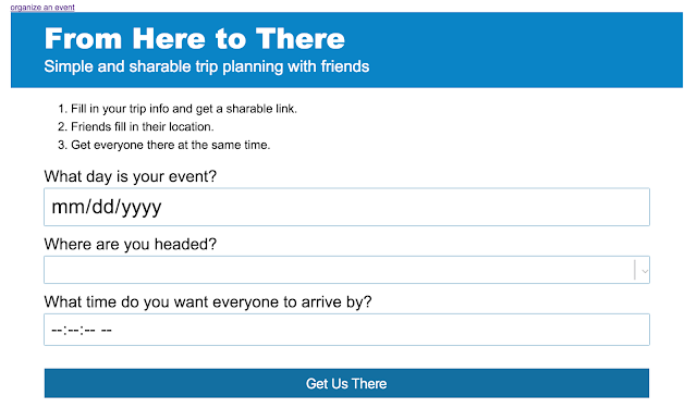
So! Gabe and I went to the New Haven hackathon this weekend and worked with 2 other cool people to build a web app! A photo posted by Emily Serven (@emilyserven) on Oct 15, 2016 at 3:41pm PDT The Project For our project, we built an app called "From Here to There". From Here to There is a trip planning tool that allows users to easily plan and coordinate group activities. The "Organizer" first sets the meetup location (a train station), date, and time. The organizer then gets a link to send to participants with that information filled in. The participants enter their departure location and are given the last train that will get them there on time. The app won a prize for being the best app that incorporated a sponsor (scriptr) service. There's a bunch of things to fix, such as a better user experience and the extended train schedule is pretty funky. Plus, the detect location feature isn't finished yet. But! There was about 29 h

A comment about sound

Everyone I just want to be very clear again that you DO NOT have to add sound to your webpage designs. ONLY if you want to you can explore it and add it if it is in your interest and serves your design. I gave a list of several javascript libraries to look at and possibly think about for your advanced pages based upon your interests, sound is only one of them. https://threejs.org/  if you are interested in 3D interactivity http://processingjs.org/  if you are interested in 2D [mouse movements and design] https://github.com/jakubfiala/atrament.js   if you like drawing and hand rendering https://github.com/lsu-emdm/nexusUI/   for interesting UI/UX designs of sliders, buttons, graphs etc. [the example uses audio as an example but it's really about UI/UX] https://github.com/Tonejs/Tone.js/tree/master/examples  if you are interested in adding sound In addition for modern art practice and edge and advanced study we mentioned http://nickbriz.com/thenewaesthetic/   that ha

This Cadillac webpage is just awesome

Image
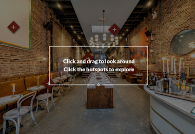
I was wondering in the NY Times then I found this page by Cadillac. There are some many features that I thing are the future of web, like the 360 view and the mobile gyroscopic view. It is based on WebGl as we have been studying. http://paidpost.nytimes.com/cadillac/sophisticated-interiors.html

So far according to my portfolio

Image
I found this website  http://www.hongkiat.com/blog/ scrolling-effects-js- libraries/ which has great examples of .js features that I am trying to incorporate on my portfolio.  This one particularly has potential to show the portfolio items on the website, http://www.jasonlusk.com/ scroll/ And I am taking the material from my current portfolio http://www.fernando-design. net/ . Is coming together I am working on quick animations using js

More Avenues of Exploration for next week

Image
"If Postmodernism rejects the functionally-driven design of Modernism, the New Aesthetic is a "Semimodernism": it embraces the formal results of functional design but ignores the motivation." - Kyle McDonald  Hello Class Like i shared in class, while we are spending time in studio work i want you to bethinking in parallel about the things i am sharing with you. Whether that takes the form of Threejs tutorials to add interactive 3D to your pages, Processingjs to add ascii code art videos to your sites or incorporating APIs for the aware websites of the new millenium i want you to also at least indulge in the research aspects of Tone.js [Audio for Browsers]and a few mor ethat i want you to investigate and i wil go over in class on Tuesday   http://nickbriz.com/thenewaesthetic/  "theNewAesthetic.js is an executable-essay / open-source javascript artware-library for quick [re]production of 'New Aesthetic' compositions and related new-media art tr

Hardware and Software: Expanded Cinema by Gene Youngblood

The similarity of brain and logics to the computer’s hardware and software is a good point on the book Expanded Cinema. In the chapter “Hardware and Software”, the author simplifies the communication between our brain and the machine, noting that the information passed along is translate from thought the programming language. As web designers, we experience this process daily. As front end designers we may not be always in touch with certain languages, but HTML, CSS and JS are the language in which we translate our sense of design. Being fluent in these “languages”, help our brain to turn thoughts into visual elements. The relationship between “our” hardware and software is astonishing. Every time we learn a new subject, language, trick or any simple thing, we are working to “update” the software in our brains. Beyond all this, I believe that we designers have a big responsibility to be updating out knowledge regularly, because technology in general follows a fast paced moderni

Wave-Front Reconstruction: Lensless Photography

Image
"Light waves are described by their intensity and frequency; ordinary optical photography records only the intensity of the waves, not the frequency; yet the frequency is the information necessary to reconstruct a three-dimensional image" I know this is too much to absorb, but it is so amazing to think about a world made of holograms, which is the whole point of what is described in the first paragraph.   Did you know that in the 1960's an aircraft company in California invented the laser? Well, this is just the beginning of Holograms... later someone else came and used the laser in a modification with an original holographic technique and produced the first successful three dimensional image. I imagine myself in a world of holograms and it would completely change the perspective of many of the things I am used to, but I am pretty sure that with time, I will get used to it and begin creating in my "design" world new ideas and ways to prod

A Case Study (?) of a JavaScript Problem

This week at work, I ran into a very basic problem that needed to be solved with JavaScript. It involved lots of trial and error, but after 3 hours or so, I finally solved it. I wrote an article on my personal blog detailing my thought processes and research trail, in case anyone is interested:  http://emilyserven.net/2016/09/30/js-problem.html (I also included a bunch of footnotes, so if any jargon is confusing, it should hopefully be explained in those.)

EXAMPLE FOR FILIPE

https://www.dropbox.com/s/id2hfrd1y8o091h/example.zip?dl=0

Don't Make Me Think Response

Something that popped out of the reading is the section is was " Everything can't be important!" As designers, we are often told how to be thoughtful about what we are placing within a design. I feel like we fret about the tiniest details within the design because we are always told everything is important. It was refreshing to know that we don't always need to sweat what's important .

Don't Make Me Think

The conversational tone of Don't Make Me Think  subtly communicates exactly what the author is intending to convey in the literal content. The book itself is a well-designed representation of proper formatting and scannable design. Additionally, in recent years, most content on the web has transitioned to the conventional, scannable style that Krug describes in chapters 2 and 3. Any given article on a brand blog or news outlet will feature clear headings, easily interpreted bullet points, and well-positioned call-to-action sections. These elements take into account the user's natural inclination to scan , not read, while allowing for a greater absorption of information. Effective web design will increasingly rely on understood conventions of user behavior. Now more than ever, Steve Krug's insights are relevant to increase usability and engagement in online content.

Don't Make Me Think ch.1-3 (Thoughts)

It's crazy that the world wide web doesn't just stop at what is given to the users by the creator. The creator can't just create for themselves and their view on how things should operate/work. The idea that things should be self evident or if not evident, explanatory is brilliant. Without thinking about the customer and users, the world wide web would not be where it is now. There will be frustration and either the user will blame the creator or blame themselves for not knowing what to do and this is where competition comes into play. If a user feels a web site is too complicated then they will go to a website where things are clearer to them. Then there are those who have no choice but to continue using the site but with a bad review, word will get out and people with stop using your site because it is not efficient enough and someone will make something better eventually. Complexity and layout makes a difference in design. The three "fact of life":We don'

Reflections on "Don't make me think"

Don't make me think exposes many aspects of the web that we take it for granted because we are born in the internet generation. First, the terms that he uses are very understandable by most readers because it is direct and it has a natural conversation tone. After all, chapter 3 got my attention because it has a down to earth approach on the design aspects of the webpages. As Krug writes, certain features of a webpage are definitely safe if following traditional approaches. The best comparison to it is the stop sign one, as red and green are universally accepted as stop and green respectively. Krug points out many aspects of web design that we take for granted but still can be further explored. First, a web page is not a book page, so the visualization process of a page is affected by its content presentation. Also, web layouts have many aspects that users are used to for years, as where logo or menus should be places for easy identification. However, designers that break traditi

OFFICE HOURS

Hey everyone I know i may have been a little difficult to track down this past few weeks. With moving and settling in and a bunch of final move details, my schedule has been a little fuzzy but i wanted to share that my OFFICE HOURS will officially be T W TH 3-5 PM Or by Email appointment if you need longer than 30 minutes of help [i will spend as much time with you as needed if there is no one waiting of course] If no one is there by 4PM I will be in SPLASH PAD Thanks for your patience as i have gotten settled here @ UCONN. Evening Classes are new for me :-) Patrick

Ch. 3 Response

Chapter three of the textbook talks about how the overall look of the website is very appealing to anyone who's interested. I think it was very helpful how this chapter talks about hierarchy on a web design. It helps designers to shift the user's attention depending on its color, text font and image. This chapter referenced the newspapers's headlines where the bigger the font the more relevant the story will be. This reminds me of html coding, with heading elements with h1, h2, h3 and so on.  Complex websites for newspapers, blogging, or business have a lot of context. It was very helpful to understand how this chapter explained to put containers on each section of the website and put hierarchy on each container. It was also helpful that this chapter showed how to break up pages on a website. To not put a solid vibrant border around it but make it more appealing into the eyes. Seeing photos of web designs back then made me think about how important color palettes are.

Chapter 3 Response

The first thing I read in chapter 3 is the author telling us about stops signs and how the color and shape always tells us that we need to stop. Red is a color that stands out among others and there was a design process behind the stop sign. Same with every car, if each gas pedal was in a different place for every car then we will have a bunch of confuse users. I believe that this applies to the web. It is good to innovate like the author said but it is very important to understand the value of what we are replacing. I think the web is something we can do a lot of things, designing a website can have a lot of possibilities. Just browsing through the chrome experiments we can see that there are many ways to manipulate particles and there a tons of cool designs out there. But how do we make them innovative and user friendly?  We do have to keep in mind our headers or at least highlight the most important things while we are designing out website. The author mentions that is im

Response to "Don't Make Me Think!" by Steve Krug

This definitely is not the first time I've read this book. I've probably read it at least 3 times by now since I first found it in my high school sophomore year. At that time, I was only making websites as a hobby and hadn't considered it as something I could potentially make a career out of. One of the things I love about the book is that Krug also practices what he preaches. The book is easily scannable, easily readable (using concise vernacular), and is a very unintimidating read. The concepts that Krug talks about (in these chapters, 1-3) are timeless ideas. I think that the most important chapter in this set is the second one, describing how people don't follow any optimal path the designer has set for them. User behavior is the thing you absolutely cannot control in an environment that developers are used to being able to fine tune. Even if everything is 'technically' correct, if you don't keep in mind and attempt to plan for real user behavior, you

reflection on 'don't make me think'

Chapter 3 really caught my eye. When I first read about "conventions," I really didn't know what the author was talking about. Once I started reading, I realized what conventions were. Stop signs all have a universal meaning/ look to them for a reason. Cars all have a universal set-up for a reason. Websites really have changed over time with the layout. It's so different than every day things we're all used to seeing (cars/ stop signs). People expect there to be a logo and a navigation bar, but there are plenty of designers that want to 'break the rules' and do what makes them happy, not what others want. That's what I love about web design. You can do whatever you want. You can create whatever content you want because it's about YOU (well, at least a portfolio site). Doing things against what other people say is a hard thing, especially when society is expecting certain things out of you (certain placements on the website, certain content, cer

Don't make me think.

The first thing that got my attention on this book was the kind of language it uses. It is very conversational; it applies humor to a subject that can sometimes be boring. The result it is an engaging read for us.  I like the way the author often analyses the human behavior and attitudes toward the web. For example, in chapter 2 he states "We don't read pages. We scan them." He explains his observation, illustrates it with an unusual analogy – the point of view of a dog when its owner is giving orders – and makes a conclusion.  On that topic, I totally agree with Krug. We only see what is interesting to us while we are online. Unless you have a lot of spare time, we often go online to find specific information or personal interests and we bypass everything that is not related to what we are trying to find.  He goes on with that scanning process in chapter three. The way information is presented online must be simplified. Designers shouldn't treat text like

Conventional web design? Would you go this way?Chapter 3 thoughts

There are many things you can do when you are a designer. As a designer you want to be the most creative you can be, you want to explore new things and be innovative. Why not? This is why we have been studying all of these years to become "artists" of the web, animation, marketing... There are many things we always want to end up doing, and I am pretty sure we all want to land in a job and be the best we can be... but did you know that sometimes is good to use the conventional and let your creative self to one side. Being conventional does not mean that you are not a creative person, it means that you know that sometimes to achieve what your audience is going to interact with, you have to keep what they already know. For example, as explained in chapter 3: the stop sign. It does not change even if you are in another place of the world.It is always red and with the same shape; the reason being that conventions make life easier to digest! When designing for the web, there a

The Medium is the Medium (Thoughts a Little late with this).

Marshall Mcluhan understood the transfer from oral communication to print communication. From my understanding he believed that there will be a balance where all of our senses would be unified and understood in different ways. I believe he began to talk about the internet as we know it today. The idea that any consumer can become a creator to potentially appeal to others around the world doing animations, Vlogs, and many more kinds of great content to match the style of the medium. People who create content on the WWW are subconsciously writing language to the new medium and is why new innovations are important and have to continue to happen.  The technology that transfers the message, changes us and the society we live in.

VR and Snapchat Issue #50

I found this particular section of Issue #50 in Dev Dinner kinda of surprising. Before reading this issue I had thought of VR as a newer technology that has yet to come to market at a mass scale however this particular section of Issue#50 was all about particular VR enthusiast to follow on snapchat. Reading about how the are already influencers on snapchat dedicated to VR shows me not only how much more quickly VR is coming to the market but it also demonstrates how much more quickly early adaptors take into account new technology. While most people only consider what new mediums will look like web designers have the task of thinking how they will design for these new mediums and VR is no exception. 

Issue #54 - Dev Diner

This summary is not available. Please click here to view the post.